Tomato
An ERP and CRM for small to mid-sized supermarkets in South Korea
Mattie Lee • • 6 min read
#UI/UX#Product Design#Design Systems#Front End Development
In a nutshell
Tomato is an ERP (Enterprise Resource Planning) to replace the old-school management system for non-corporate supermarkets. As a lead UX Engineer, I managed a small team to ship a product in an agile environment. I defined the product's visual elements, designed wireframes, contributed to front-end development and created design system and implementation guidelines for developers to streamline processes.
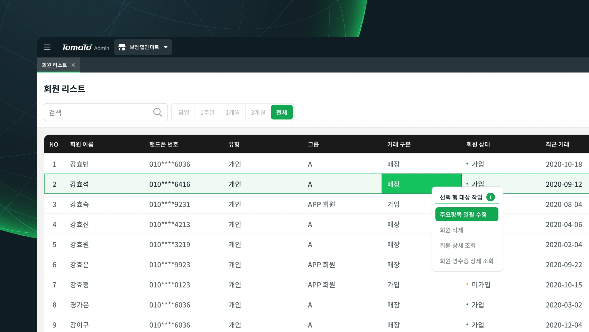
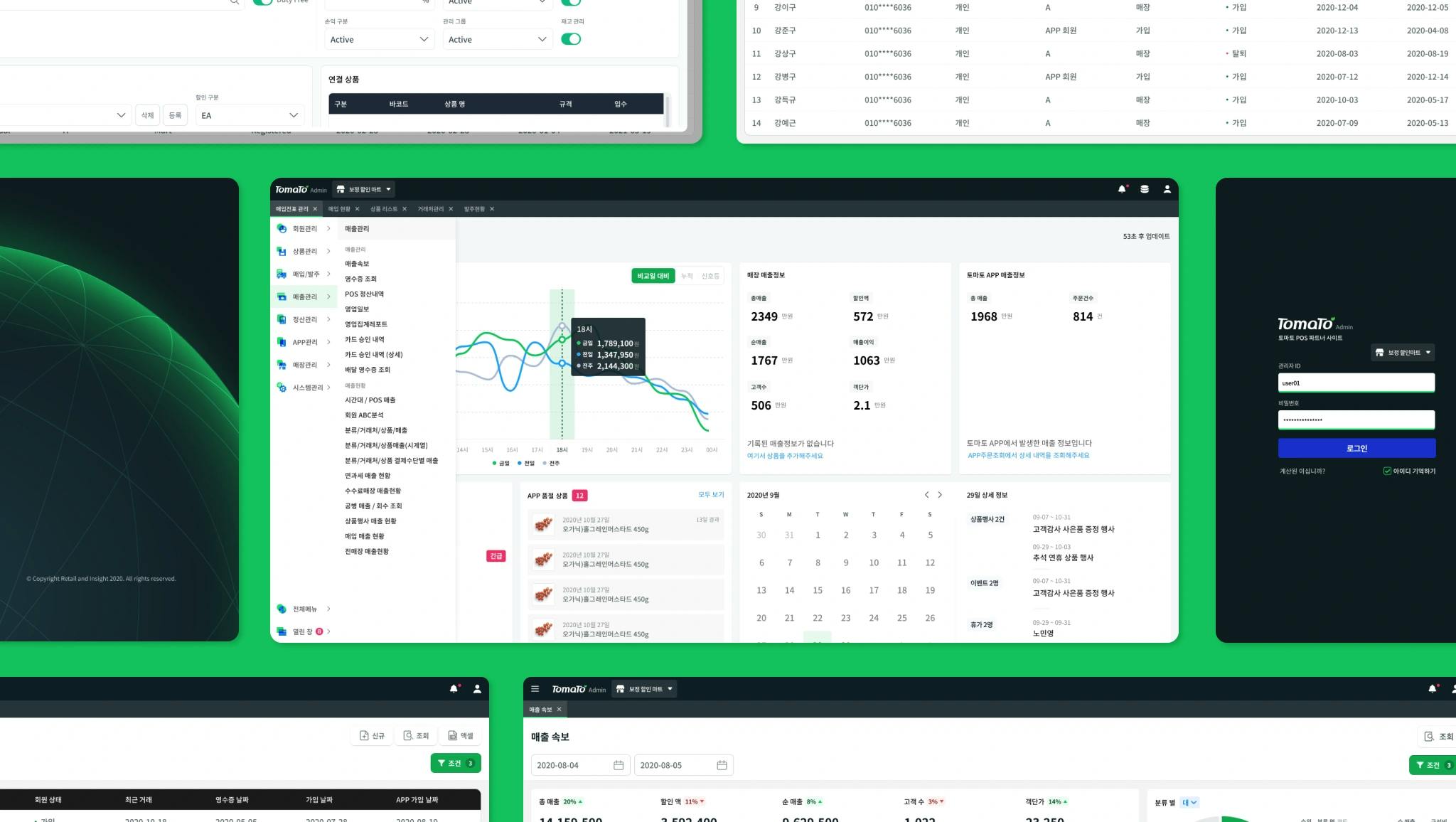
Redesign before official release
Following the milestone-based roadmap, Tomato went through a series of testing phases. We mainly had an alpha phase for the existing customers and then a beta for customers who wanted to test it out. During these phases and testing MVP (Minimum Viable Product), We've collected feedback from beta customers and redesigned the product.
Most users are Generation X (1965-1980) or Baby-boomers (1948-1964). They are less familiar with interacting with technologies, and often have vision disabilities. Therefore, the product redesign focused on the following:
- High contrast ratios across UI elements
- WCAG 2.1 AA compliant color scales
- Clear affordances to Call to Action (CTA)
- Accommodate fast data entries and inquires
- Familiar workflow but better UX than previous products for migrating customers.
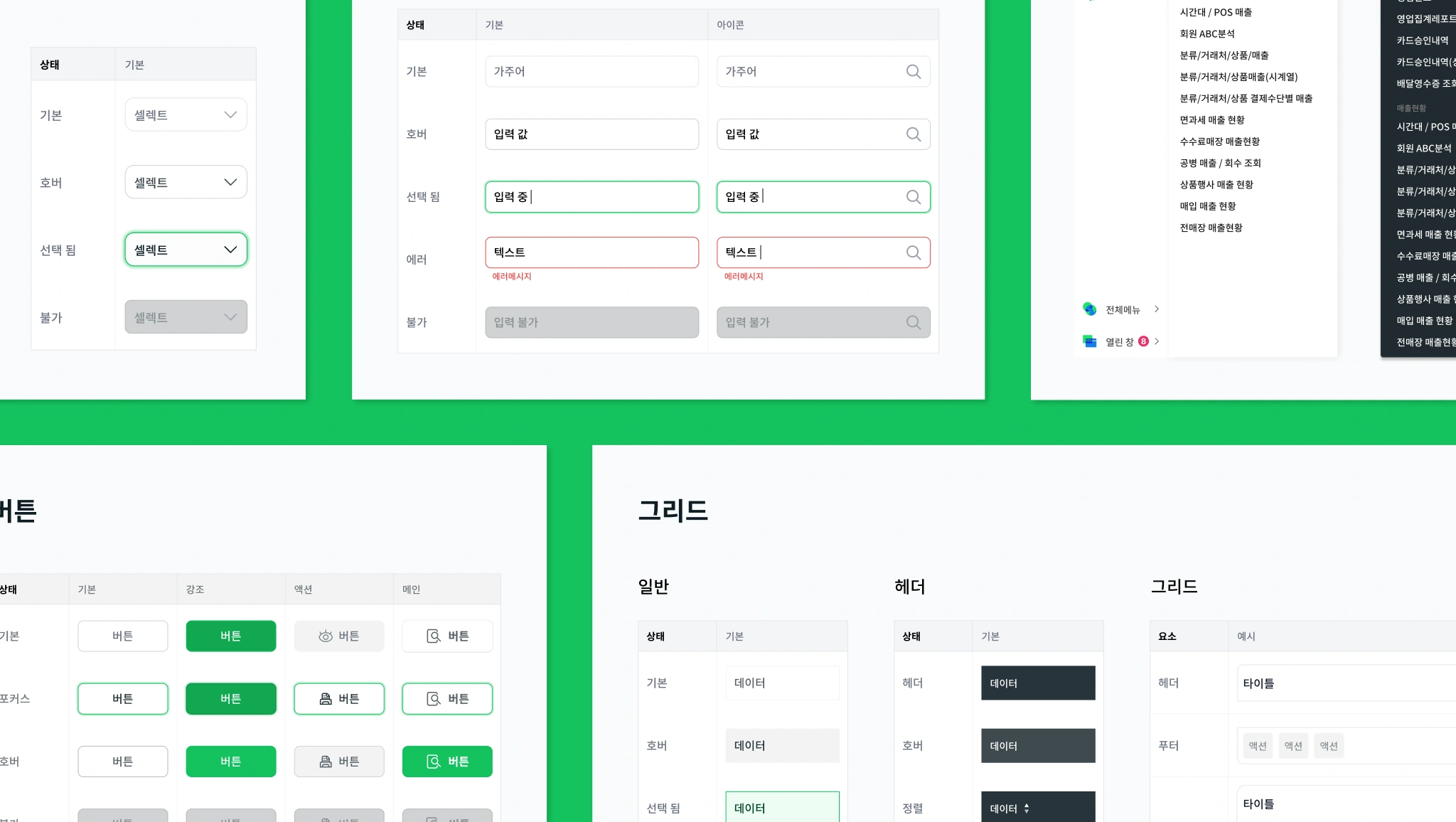
Design System
Without a design system, there were no prominent way to troubleshoot and resolve issues with bugs, visuals, and interactions,
because there were no real delegated source for UX and design decisions. Therefore, I needed to create a scalable and
maintainable design system to better communicate with developers and directors, resolve problems, and quickly ship
features to the end-users.
Creating Guidelines
As a UX engineer, I was responsible for implementing HTML and CSS layouts and interactions with Javascript and jQuery.
When I created generic layouts for the developers to copy and paste, the developers struggled to implement designs
that deviated from the original format. Implementation guidelines reduced the time spent troubleshooting layouts and
components caused by mistakes and miscommunication.
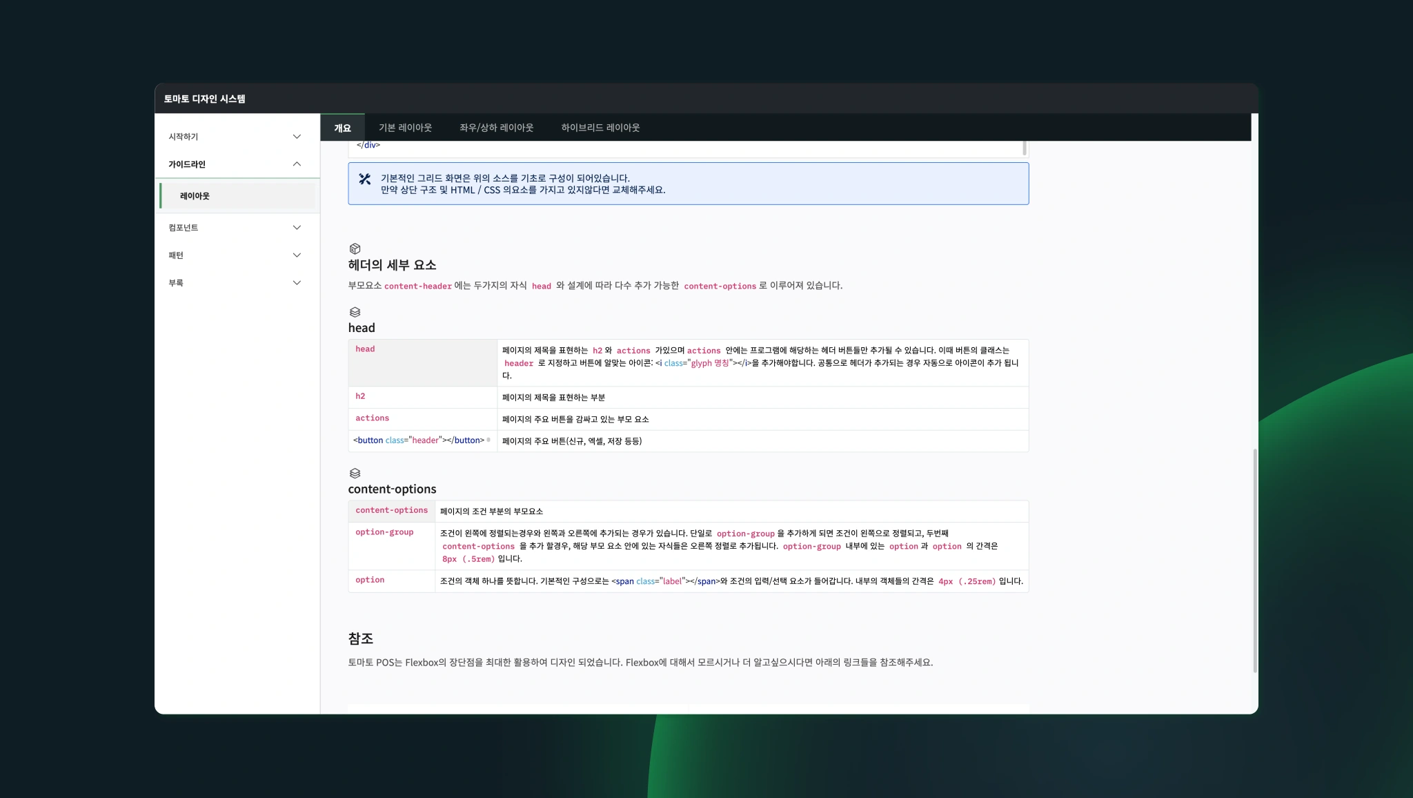
Internal publication of the design system consisting components and their functions, UX patterns, helped me communicate with the stakeholders and make design changes efficiently as possible.
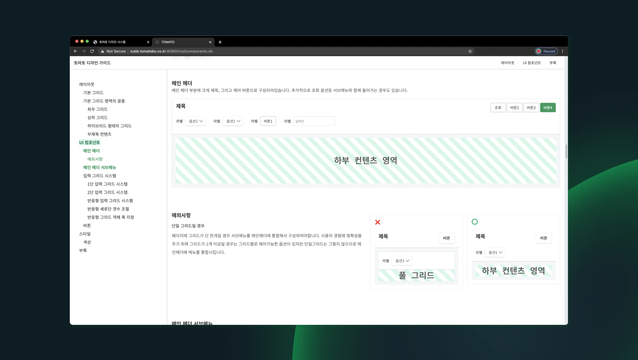 Using the pattern and layout guidelines as a reference, any implementation that didn't follow the guidelines was easily
identified during QAs and accelerated hotfix and ship process. It also became a central source and a common language
to discuss design changes.
Using the pattern and layout guidelines as a reference, any implementation that didn't follow the guidelines was easily
identified during QAs and accelerated hotfix and ship process. It also became a central source and a common language
to discuss design changes.
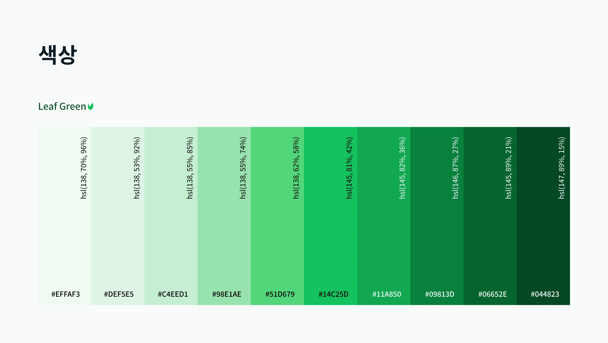
Choosing primary color scale
The choice of the primary color was inspired by the leaf color of tomato. Green as the main color instead of red made more sense because red is a code for warning, danger, or something negative.
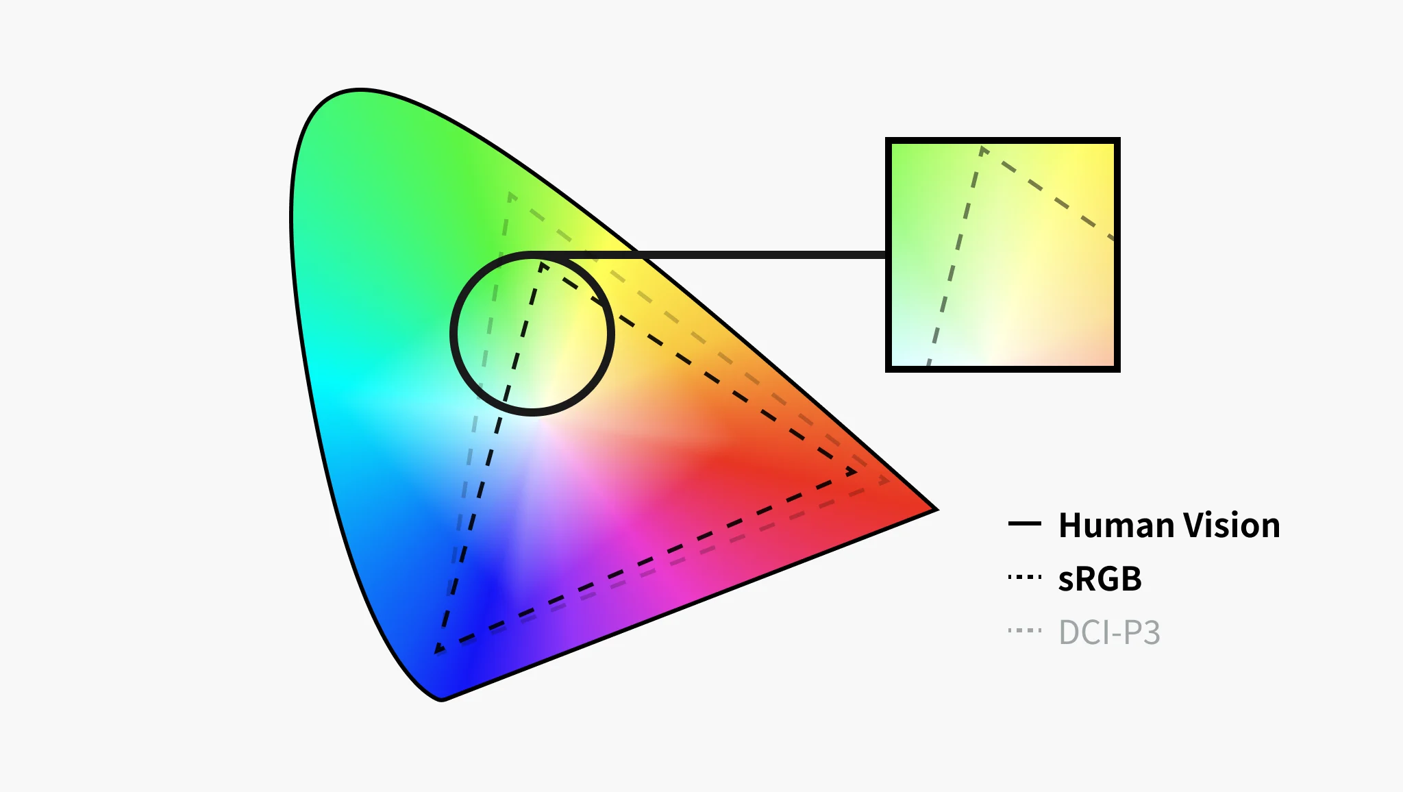 Color gamut describes a range of colors within a spectrum of colors. In the case above, the sRGB and DCI-P3 represent
color spaces within human vision. sRGB is the most dominant color space out in the market for regular monitors, and DCI-P3
is becoming more prevalent. Compared to what humans can see, monitors can output a significantly tiny amount of greens.
Because of this, green on a color scale may look extremely florescent or blueish.
Color gamut describes a range of colors within a spectrum of colors. In the case above, the sRGB and DCI-P3 represent
color spaces within human vision. sRGB is the most dominant color space out in the market for regular monitors, and DCI-P3
is becoming more prevalent. Compared to what humans can see, monitors can output a significantly tiny amount of greens.
Because of this, green on a color scale may look extremely florescent or blueish.
 Experimentation with many color appearance model such as RGB, HSL, HSLuv,
and CIECAM02.
Experimentation with many color appearance model such as RGB, HSL, HSLuv,
and CIECAM02.
After referencing colors from various models, I've chosen the colors carefully to create a perceptually uniform scale and focused on selecting and tweaking the colors as close to the green people would normally in the non-digital world.
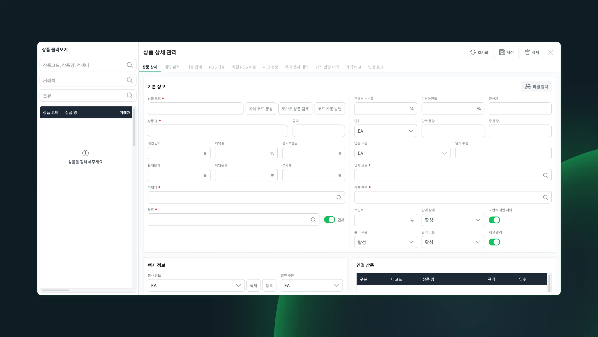
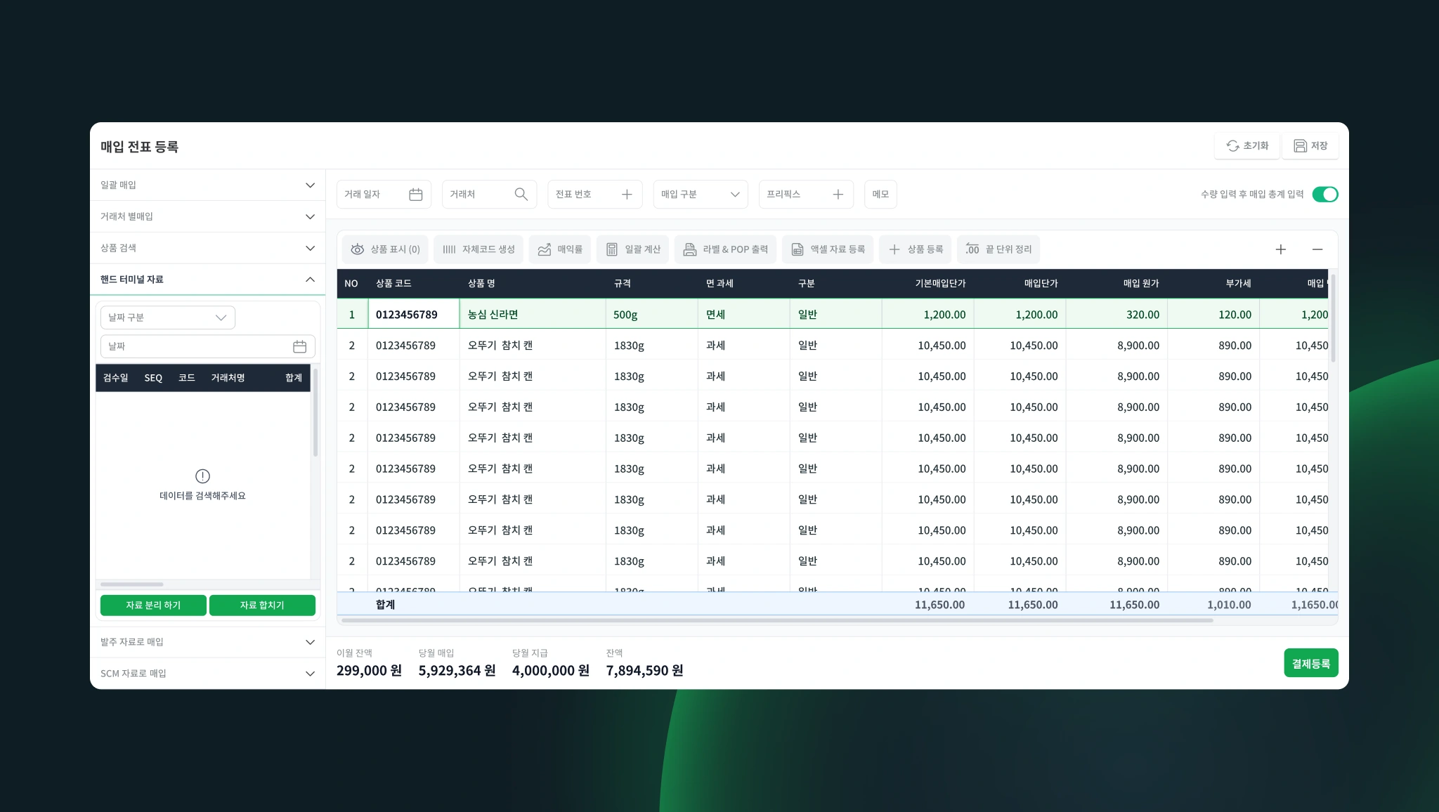
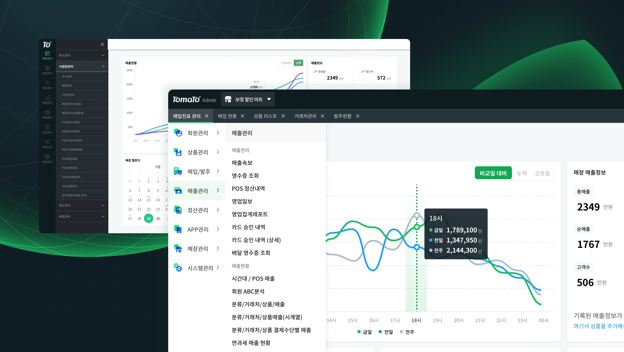
Component Implementation
We had no component-oriented front-end tech stack for the project. The only technology I was able to use is SCSS and pure javascript or jQuery. Since interactive components aren't powered by frameworks like React or Vue, for example, I've created a simple javascript module to create reusable components like so in the code below:
This way, if the HTML/CSS of a Breadcrumb component is changed, I can refer to this specific file, and changes will be updated across multiple pages using this component.
Styling with SCSS and BEM
I tried many CSS methodologies in an attempt to be efficient and be clearer with the interfaces we are implementing. First off, I started the project with self-wrote utility classes to style every page. However, when working with the developers, it was hard to refactor and make changes to HTML and CSS because component/layout level changes don't change with CSS. Developers, including myself, had to identify changes and apply appropriate utilities to make changes manually.
The ultimate methodology I've followed was BEM (Block Element Modifier) and SCSS to break down blocks into atoms.
One thing I like about BEM is that its naming convention is consistent. Prefixes such as __ and -- are designed
to be non-dependent on each other. Which makes it easier to maintain and understand. CSS took full advantage of design
tokens such as sizing, typographic properties, and colors by utilizing pure CSS variables - making it more maintainable.
Example above used CSS variables to style the select element and modifiers to style it. It may seem verbose, but having over approximately 10,000+ lines of code, tokenization and verboseness made it easy to understand and stylize.
Design outcome